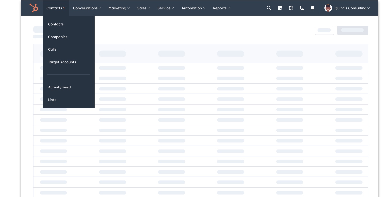
The old dynamic — static IA
Navigation was the only discovery surface — and all Hubs' activation targets depended on it. Any IA change threatened someone's metric. The static IA forced a zero-sum negotiation: someone had to win, someone had to lose.
The new dynamic — adaptive system
Personalized nav makes that negotiation irrelevant. Every group's tools surface for the customers who need them, through the surface that makes sense for that moment. Nobody loses.
Personalized navigation and bookmarks (March 2026)
+22%
CRM tool usage
Users oriented faster and built habits around core tools — the core hypothesis confirmed.
+4.3pp
Starter retention at week 7
The most commercially meaningful signal — connects directly to LTV and revenue health.
CVR flat
Purchase conversion held
When upgrade intent is real, users find the path. What we had shown in the nav wasn't converting — it was noise.
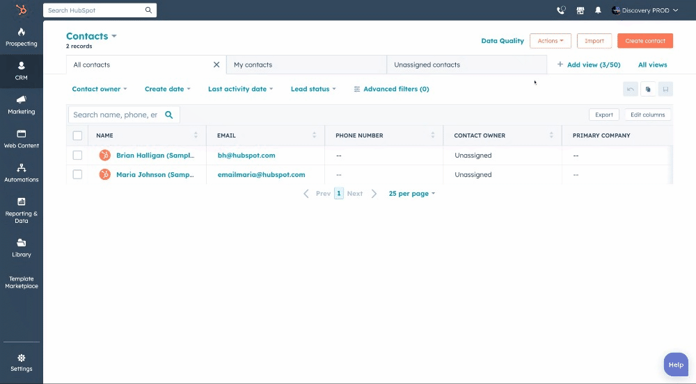
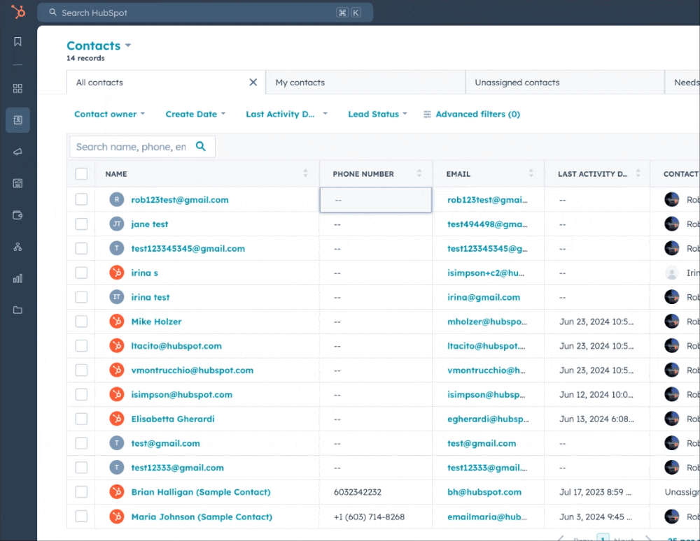
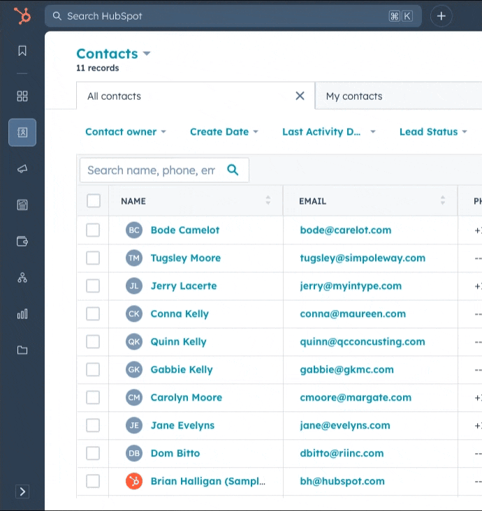
Upmarket / Downmarket needs
Downmarket customers consistently report that HubSpot's navigation feels overwhelming, cluttered, and misaligned with how they use the product. Our usage data on downmarket users points to 76% of clicks going to only 5 tools.
Downmarket path
Reduce overwhelm. Speed time-to-value.
Starter packs, curated nav for the job you hired HubSpot for, fewer irrelevant options on day one. Activation through relevance, not instruction.
"This [the nav] causes complexity and a feeling of overwhelm. The other guys have figured it out."
"I want to be able to turn off features I do not use…"
Upmarket path
Admin control. Governance. Precision.
Admin-controlled templates, nav governance by role, the ability to shape the platform for an entire org. Enterprise readiness without removing individual flexibility.
"My goal is to be more focused in what they're able to see so that they don't have to think… And then they say to me HubSpot is too complicated."
"Many of our folks are not tech folks… they get overwhelmed by the amount of options that it actually makes them kind of shut down before they even start to use the tool."
Navigation as the surface of an agentic onboarding system
The personalized nav isn't a smarter menu
It's the first moment a new HubSpot customer sees a product that already knows something about them — built from their stated goals, enriched by data about who they are.
Intake
User declares goals
At signup, you tell us what you're trying to accomplish. The signal the whole system builds from.
Data enrichment
We enrich who you are
Company data, cohort of similar users, industry and size. A richer picture than what you typed.
Nav output
Your nav appears
Opinionated template matched to your goals and profile. Not all of HubSpot — the version built for you.
Ownership
You take over
Pin, reorder, group. The smart default becomes fully yours to shape as you grow.
Admin layer
Enterprise governance
Admins assign templates org-wide. Individual flexibility within guardrails they set.